Author: DANIELLE FLEMING, Creative Manager
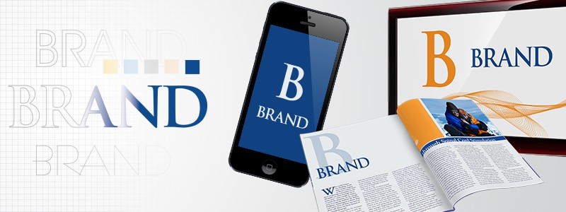
Your company needs to have a brand identity that is easily recognized and stands out in a crowd. Brand identity, however, goes beyond just a strong logo design and the messaging you create. You also need to build what is called your “visual position.” Your visual position is played out across your entire brand, for every piece of marketing collateral, your website, your business cards, and more. Your visual position is just as important as the verbiage you use when shaping your brand identity.
There are various ways to develop your visual position. Here are four aspects that you can build upon to strengthen your identity and increase your brand recognition.
Play Up Your Color
One easy way to enhance your visual position is to play up a single color from your set of brand colors.
For most people, use of color for a brand is something that is very memorable. Taking a single color from your branding colors and using it as a prominent attribute in your marketing and advertising efforts will help create a lasting impact on your consumers.
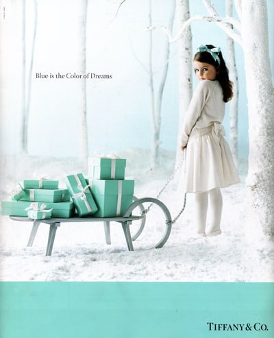
EXAMPLE – Tiffany & Co.
One company that does this visual positioning technique well is Tiffany & Co. Almost everyone knows “Tiffany Blue.” There is an everlasting association with Tiffany’s little blue box and the gift that is nestled inside. That is because the company strategically advertises with an emphasis of its unique robin egg blue color as a focal point over and over again. The emotional feelings that Tiffany & Co. strives to create in its messaging is significantly emphasized with the recognition of the Tiffany blue.
Use a Distinct Typeface
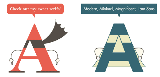
Another powerful way to establish your brand’s visual position is to using a distinctive typeface. Typeface is the set of one or more fonts chosen to represent your brand, giving it a unique character. Your brand’s typeface will be important in the feeling you create when someone interacts with your brand and your marketing efforts.
While we could easily write a full article on the discussions of fonts, to cover your basics, there are two types of fonts – serif and san-serif. Serif fonts have the small lines tailing the edge of letters and symbols and sans-serifs don’t.
From that basic distinction, there are a large variety of fonts within those two types to choose from when deciding what evokes your brand’s personality, from simple to slightly more exuberant. Here are a few samples:
![]()
You can see how your typeface choices can have an impact on your entire brand. Once you pick a set of fonts for your typeface, you can apply it to all your marketing and advertising, and overtime consumers will start recognizing your company by just a glance at the fonts used – especially when paired with an emphasized brand color as mentioned before.
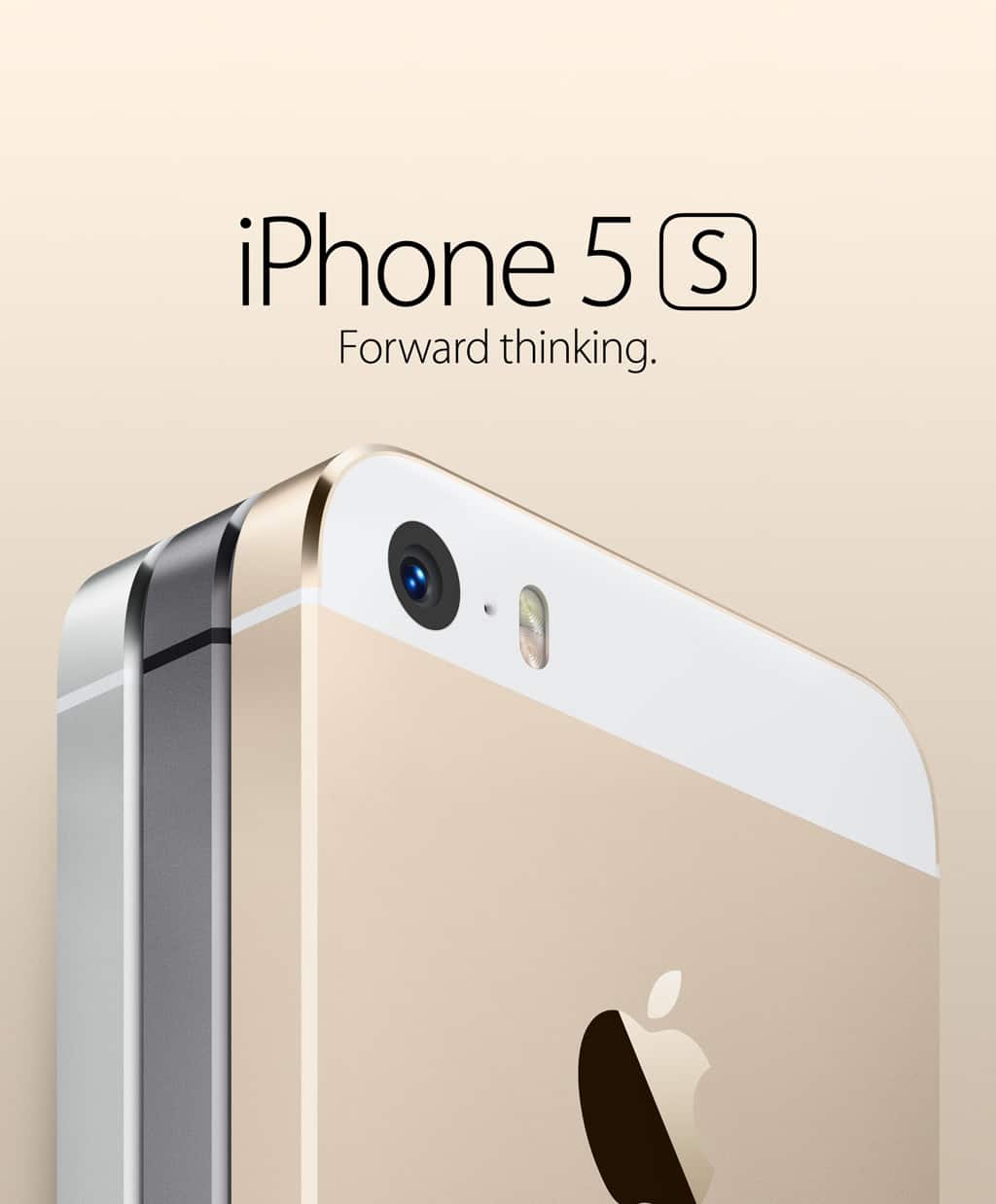
EXAMPLE – Apple
Apple has done a magnificent job branding itself with just its typeface and its product. The san-serif font is iconic Apple because the company uses it on everything from its products to packaging, advertisement, website and more. No need for flashy graphics, typeface and a product shot is all this company needs to establish its sleek and simple visual position that it aims to make.
Repeat a Shape
If your company’s logo has a noticeable and simple graphic shape as a part of its icon, use it to its full potential. By using your icon in other formats on your marketing and advertising pieces you are reinforcing that visual, enhancing your visual position and generating greater brand recognition.
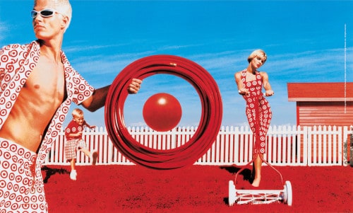 EXAMPLE – Target
An example of a company that you can identify just with the logo icon alone is Target. Target is very clever in the way it repeats and uses its icon in various unique ways to reinforce the brand, through print ads, TV commercials and more. You probably recognize this icon yourself, proving the lasting impression it has generated.
Use a Character
A character, a specific person with a distinguishable personality, can also be a significant and effective visual positioning attribute when shaping your brand identity. Having this character as a central part of your brand not only gives something tangible for people to recognize, but also gives it a precise voice by which your audience can associate with.
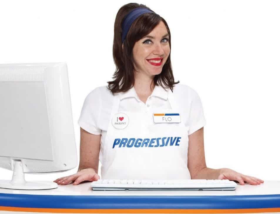 EXAMPLE – Progressive
Flow has put a face and personality to Progressive Insurance Company. This character has created an approachable and relatable feel to the brand, which is quite a feat when it comes to selling something as stiff as insurance. Flow has created a very positive image for this company, giving consumers the feeling that the company is indeed just an honest, bubbly and down to earth brand.
When it comes that time where you are in need of building a brand, remember these four surefire ways of creating an effective and unique visual position for your company. Implementing one, if not a couple of them, will definitely help create that long-lasting recognition every brand strives for within their industry.